Banner Components
Banners are Components designed to attract the user’s immediate attention, and are often used on homepages or at the top of a page. Landing pages or major section homepages should have a hero or banner of some kind on the top of the page.
Usually, banners have limited amounts of text.
Although they can be used as just an informational module, typically banners have one or more CTAs (Calls to Action) linking to other content.
Hero Component
Heroes are typically used on the top of a homepage or landing page. In this design, they contain only a large image with a white background. For content blocks that require a CTA (Call to Action) link, use one of the other Banner Components.
- No additional options
Hero Component Template Documentation
Alert Component
Alerts are simple, short full-width Components placed near the top of a page. Their intention is to inform users about important or timely information. They contain one line/one sentence of relevant information and optionally a link in the text.
There are additional Alert Banner Components that meet specific needs. For example, the Alert Banner with Dropdown is used for the QuickLinks banner on the home page. The Alert Banner with Header Component can be used when an urgent message is needed for the home page - for example, emergency closings.
Alert Banner Component Template Documentation
Banner Component
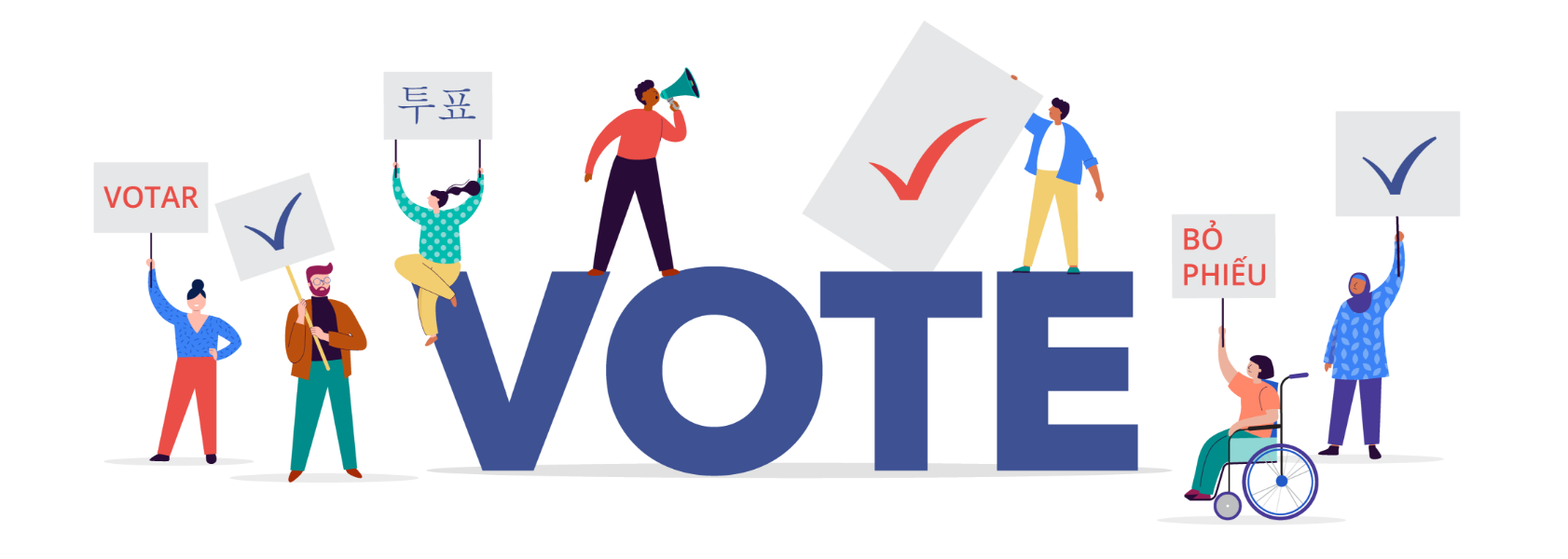
Below is the basic banner component with an optional CTA button. If the button is not used, there is the option to include a link around the entire banner.
The illustration can be placed on the right or left side of the banner. On phones, the banner illustration stacks on top of the other banner content.
Options:
- H1, H2 or H3 header
- Illustration on right or left
- CTA button or all-banner link
Banner Component Template Documentation

Banner Component 2
This is a variation on the basic banner component. It includes a background image for larger screens, and a mobile background image, but no foreground image/illustration. The positioning of the background image on larger screens can be set (top left, center center, etc.) The mobile version of the background image should be semi-transparent so text will be legible on top of it. Like the Banner Component, there is an optional CTA button. If the button is not used, there is the option to include a link around the entire banner.
On desktop, the text can be placed on the right or left side of the banner. On phones, the text is centered.
Options:
- H1, H2 or H3 header
- Illustration on right or left
- CTA button or all-banner link
Elect Banner Component 2B/2 Buttons is a variation on this template with 2 stacked buttons below the text.
Banner Component Template Documentation

Banner Component Centered Text
The Banner Component Centered Text is a simple banner with background image, centered header and text, and a single button below the text. A variation on this component, the Banner w/3 Buttons Component, has three buttons centered on desktop and stacked on mobile.